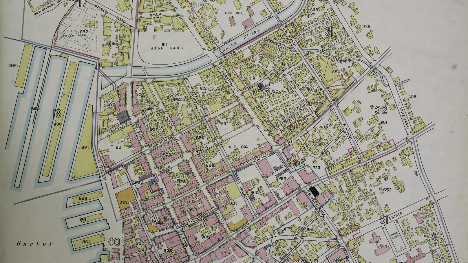
Sanborn fire insurance maps used colors and symbols to record construction materials as well as addresses and streets.
Article
If buildings on an old neighborhood map are colored pink and yellow, those colors may be more than decoration. The Library of Congress’s guide explains that Sanborn fire insurance maps used colors and symbols to identify construction materials and other details.
Insurers needed to assess conditions an address alone could not reveal. Wall materials, distance from neighboring buildings, and nearby facilities all mattered when considering how fire might spread. Small lettering and patches of color show that buildings on the same street could have very different structures.
In the lead image, a long wharf runs along the left beside clusters of pink and yellow buildings. On Sanborn maps, pink generally indicates brick and yellow wood-frame construction, explaining the different colors along one street. Symbols vary by period and edition, so the original key remains important for precise interpretation.
The information extends beyond color. Mapmakers recorded stories, uses, and the arrangement of walls. In a lane of adjoining buildings, understanding where one building ends and which walls meet a neighbor changes the reading. A view from above contains clues to interiors and boundaries as well.
Readers today can also trace the streets connecting the harbor and town center. Enlarging the map reveals large facilities near the wharf and smaller buildings crowded into lanes. Recording shape and material together preserves a view of what stood where and how close different structures were.
Information once used to assess insurance now serves as a record of a neighborhood. After the buildings have gone, the map can still show which shops stood together and where walls separated them. Their materials remain readable because those construction details were investigated and recorded when the maps were made.
Sources and editorial notes
guides.loc.gov · Official source
Editorial note: Factual statements are based on the sources above; interpretations reflect MUADAILY’s editorial perspective. Image: Sanborn Map Company / Library of Congress · Public Domain · Cropped detail.
Machine-translated from Korean. Read the original.