Harry Beck turned the London Underground map into a diagram of station order and connections. Relaxing geographical accuracy made the network easier to read.
Article
A route map that follows every bend in a city can make the next station hard to find. Names crowd together in the center, while long suburban lines stretch beyond the page. Harry Beck's London Underground map addressed this by allowing distances and directions to depart from their geographical positions.
In the early 1930s, Beck organized stations and lines into a readable diagram. The priority was which station came next and where passengers could change, rather than the exact curves of the tunnels. He prepared his design in 1931, and the printed map entered use in 1933. London Museum describes a rejection and a trial distribution along the way.
Beck had worked as a technical draughtsman in the Underground's signaling department. Transport for London connects his approach with electrical circuit diagrams, which make connections between complicated lines clear. He arranged color-coded routes and their meeting points instead of following tracks at the same scale as streets above.
The lines followed a set of directions: horizontal, vertical, and 45-degree diagonal. The dense central area expanded to make room for station names; long outer sections contracted. Connections remained legible even when distances on the page no longer matched the journey.
Interchanges needed distinct symbols. In the 1933 map presented by the London Transport Museum, diamonds mark these stations. The first version did not contain every symbol familiar today. Others later revised the map, while its basic emphasis on connections rather than geography continued.
Simplifying geography did not make future changes effortless. An added station or extended line still required room for names and routes. Transport for London describes revisions and additions to Beck's design. Keeping the diagram useful meant incorporating changes while preserving its way of being read.
The map clearly communicates station order and interchanges. Walking distances and directions above ground need a different map. Two sections drawn at similar lengths may be quite different in reality. The Tube diagram helps a passenger choose a line and a transfer; a street map helps with the walk after leaving the station.
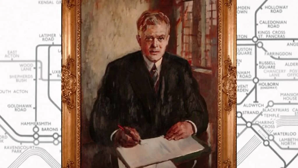
Image caption: Preview of the London Transport Museum's introduction video to Harry Beck's Maps.
Image source: London Transport Museum / Preview of the official release video
https://www.youtube.com/watch?v=zc8juOe0ibs
Image changes: resized with the original aspect ratio preserved and converted to WebP. No cropping.
Sources and editorial notes
TfL · Engineering Icons Tube Map · Beck's design background
London Museum · How Harry Beck revolutionized the Tube map
London Transport Museum Shop · Harry Beck Underground Map, 1933 · Collection design description
Source of preview · London Transport Museum / Official Release Video Preview
Editorial note: Factual statements are based on the sources above; interpretations reflect MUADAILY's editorial perspective. Image: London Transport Museum / Preview of the official reveal video.
Machine-translated from Korean. Read the original.