Jock Kinneir and Margaret Calvert designed road signs around the brief time drivers have to read them.
Article
On an unfamiliar road, there is little time to study a sign. To find a destination and choose a lane while moving, a driver must recognize a place name in the brief moment it is visible. Britain’s Jock Kinneir and Margaret Calvert designed lettering and symbols for this situation.
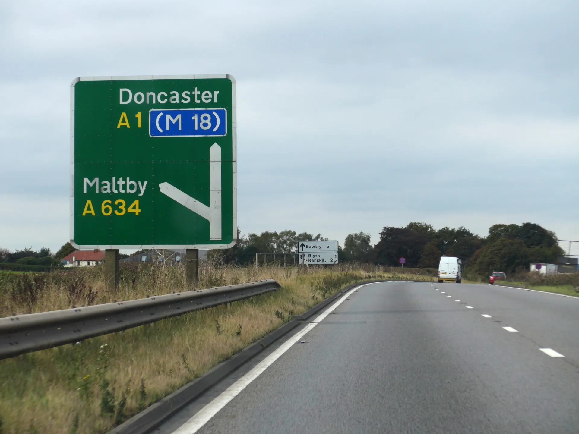
Their signs use both capitals and lowercase letters for place names. Lowercase letters have varying heights; some also extend below the line. The outline of a word can therefore offer clues before every individual letter has been identified. Along with the typeface, spacing and letter size matter.
A motorway service-area sign combines names, remaining distances, and symbols for facilities such as fuel and food. A driver looking for a destination may check the name and distance first, while someone needing a break can look for the relevant facility. Not everyone needs to read all the information in the same order.
Making the lettering larger leaves less room for words; adding words takes longer to read. Designers must decide which destination to show first and where to place the distance to the next junction before settling the lettering’s size. Signs using the same typeface can therefore differ in content and dimensions according to where they are placed.
Drivers do not navigate with one sign alone. Having seen a destination earlier, they expect later signs to name it again. Consistent lettering and symbols reduce the need to interpret each sign afresh on an unfamiliar road. Readability depends on that consistency across successive junctions as well as on the individual sign.
Where even reading a word takes precious time, pictures share the task. The Highway Code includes triangular warning signs containing images of people walking or animals. Before the image is recognized, the outer shape already signals a warning. Lettering and pictures work together to determine which information reaches a driver first.
Sources and editorial notes
designmuseum.org · Official source
Editorial note: Factual statements are based on the sources above; interpretations reflect MUADAILY’s editorial perspective. Image: Kreuzschnabel / Wikimedia Commons · CC BY-SA 3.0 · Resized for web.
Photograph / image source
Kreuzschnabel / Wikimedia Commons · CC BY-SA 3.0 · Resized for web
Image description: An A1 direction sign in England using mixed-case lettering for Doncaster and Maltby
Usage terms: https://creativecommons.org/licenses/by-sa/3.0/
Original aspect ratio preserved; resized and reformatted for web display · Adapted image under the same license
Machine-translated from Korean. Read the original.